Episode 006 | What Are We Wearing? Your Stress-Free Guide to Session Outfits
Hi, welcome to the Kelsi Bailey Photography Podcast, a space where motherhood and entrepreneurship beautifully collide. I’m Kelsi, a photographer, mama, and coffee-fueled dreamer. Here, I’ll share client education to help you feel confident in front of my camera. Honest conversations about the joys and the challenges of motherhood and inspiration for fellow creatives chasing their own dreams. Whether you’re a mama wanting to press pause on the current chapter of your life or an entrepreneur building something meaningful, you’ll find encouragement, insights, and maybe even a bit of laughter here. So grab your coffee and pull up a cozy seat, my friend. I’m so glad you’re here. This is the Kelsi Bailey Photography Podcast.
Hey, hi, hello, and welcome to this, the sixth episode of the Kelsi Bailey Photography Podcast. Picture this. You have just booked a photo session. Maybe you booked a family session. Maybe you booked a newborn session. Maybe a branding session. Maybe it’s just a milestone session for your beautiful growing baby or perhaps a petite personality portrait session for one, two, three of your kiddos. And you’re putting the session date on the calendar and then you start to do the backwards math. The mom math where we are trying to make sure that we get all of our ducks in a row before our session day.
So while this prep process is taking place, there is a little voice that’s going to jump in. Whether we invite this voice in or not, a voice is going to jump in and it’s going to say, what are we wearing? When this voice pops in, there are a number of emotional responses that you might have to this little voice inside your head. That little voice might pop in and say, what are we wearing? And it might make you feel really excited. Like, yes, this is my cup of tea. I love playing with style and color and texture and I can’t wait to plug and play with different people in our photos. And I just am really looking forward to doing this for our session.
You might hear that little voice pop in and say, what are we wearing? And it might make you feel the opposite of that. It might make you feel really anxious. Like, I want us to look our best for our photos. I don’t really know where to start. I have maybe a general idea of what I want them to look like, but I don’t know if it’s a good idea. I don’t know if I’m on the right track. I’m not really sure where to start or who to start with. I just don’t really know and a lot of those thoughts might be circulating in your mind.
You might hear that phrase pop in and say, what are we wearing? And feel literally paralyzed. Like, Kelsi, I don’t even know where to begin. What member of my family do I start with? What color palette do we go for? How do you even begin to go through? Is there like a list of color palettes? How do we choose one? And wait, hold on. What is a color palette and how does that relate to our photo session?
First and foremost, I want us all to pause and take a really deep breath. I know that this question can feel really big and really overwhelming, but I want us to remember at the end of the day, it is the people in the photos that matter far more than the outfits that we’re wearing. But I do know that this is a popular question and I ultimately want you guys to show up to your session looking and feeling like the absolute best versions of yourself.
So today we are going to talk through a list of very specific do’s, a list of very specific don’ts, and then a few tips and tricks right at the end that’ll be like a cherry on top of the sundae. So imagine us looking at Google Maps and we are looking at it all the way zoomed out. That’s where we’re starting. That question pops in, what are we wearing? And we’re like standing on the moon looking at that image of the earth. And what we want to do instead is to really zoom in, zoom into like a specific house on a specific street in a specific country. And that’s what we’re going to do. We’re going to get so specific that you’re going to know exactly what to do when you’re selecting your outfits. You’re going to know exactly what not to do. And then after you’ve listened to this episode, you’re going to jump back and you’re going to listen to episode number two, which is are you making these three wardrobe mistakes? Because this episode is a sister episode to that one. And you will have all of those tools. You’ll know what you’re doing, what you’re not doing, and you’ll be avoiding the three mistakes that I see my clients make most often.
So with all of that in mind, let’s dive on in. I’ve got my coffee mug today. My coffee mug says, oh my gourd. So oh my gourd, I am raising my coffee mug to you. I am so glad you are here today. Cheers and let’s jump into today’s episode.
I would consider myself to be an optimist. My glass is always half full. I’m always looking on the bright side of things. So it feels really natural for me to want to dive in headfirst and talk about all of the things on the listof do’s because that sounds like way more fun. But for the sake of this exercise, I want to start with a list of don’ts. And I want them to be loud and proud right off the bat because I don’t want to jump into all the do’s and then have you guys start piecing all of your outfits together and then come back to the don’ts only to realize that perhaps you’ve accidentally or inadvertently done something on the don’t list. And so then you’re having to go in and swap things out or move things around. And ultimately, I want this list of do’s and don’ts to add more ease and peace to this part of the planning process. So I want to start with our list of don’ts so that we can just get those out of the way and, well, and not do them, right? So let’s do it. Let’s dive in.
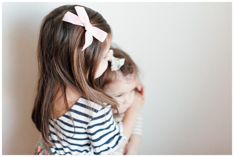
The first don’t on my list of don’ts is wearing matching outfits. I know that wearing matching outfits is really super fun in real life. It is not great for photo session life. It can also, I know, be easy and convenient if you are shopping for your session outfits and you stumble upon a dress that you love and you’re like, yes, all I have to do is buy this dress for myself, buy the matching dress for my three daughters, and then find, say the dress is forest green, and then all I have to do is find my husband and my newborn baby, a forest green something or other, and then we are all matching for our family session or our newborn session or whatever. I don’t want you to wear matching outfits. I don’t want you to wear matching prints. Here’s why. When you are all together in your photo and you’re all wearing the same color or the same outfit or the same print, it is going to photograph very flat and one-dimensional. And that’s not what we’re going for. So I want you to avoid being matchy-matchy. Because again, like I said, I know it’s really super fun in real life. We are Chiefs fans in our house, and on Sunday there is really nothing that makes me happier than my family and I wearing our matching Chiefs gear. But I would encourage you to leave the Chiefs matchy-matchy gear for your Sunday afternoon lounging on the couch. And for your photo session, avoid being too matchy-matchy altogether.
The second don’t on my list of don’ts is graphic tees. This applies to all graphic tees. It applies to your big box brand, your Nike, your Adidas, your Under Armour. It applies to our cute, whimsical graphic tees from our boutiques with the cute sayings, with the cute fonts. This don’t applies to all of those. Here’s the thing. My son, for example, my son Will has a favorite t-shirt. It is from Polished Prints, which you guys know I love Polished Prints. And it is a white t-shirt. It’s a ringer tee, and it has like a pink band around the neck, and it has two pink matching rings around the short sleeves. And then in the same pink color, it says, love thy neighbor. And I love that shirt, and he loves that shirt. But if Will shows up to our family session wearing that shirt, it becomes a distraction. When we get into our poses, and we’re putting our arms around Will, or he’s giving his sisters a hug, or I’m holding him, his words on his shirt are going to be like half covered up, right? And so when we’re looking at the final images, instead of looking at the image and saying, wow, that’s a really beautiful photo. I love that. We’re going to be thinking like, what does his shirt say? There’s some letters, and then it’s like covered up, and mom’s giving him a hug, and I can’t quite see. And so the graphic tee that we love becomes a photo distraction. And I don’t want that for you. The same can be said if you’re wearing a big, giant Nike swoosh on the front of your shirt. That is also a distraction. If you are wearing, so if you’re shopping like Polo Ralph Lauren or Abercrombie & Fitch, and you end up with their little logo, like the embroidered logo on the top kind of left-hand corner of the shirt, kind of where the pocket goes, I am not talking about those being a distraction. I’m talking about if you’re wearing a shirt from Abercrombie & Fitch, and the moose is taking up the entire front of the T-shirt, that is on the don’t list. We do not want graphic tees to be a part of our photos and become a distraction to us and to the people viewing your images.
The third don’t on my list is neon colors. When I think of neon colors, I immediately think of my dad. He is so quiet in nature and so loud in his wardrobe choices. He is famous for wearing any fluorescent neon color, and I love that for him until we need to put him in a photo. And so it is a huge don’t. Neon colors are a huge don’t. Here’s the thing. You’re wearing neoncolors, and maybe you’re the only one in a neon color, and you’re fluorescent yellow or you’re highlighter pink or you’re highlighter green. And if you are the only person wearing a bright color like that, first of all, you’re going to stick out like a sore thumb. And that might sound kind of fun when you’re planning your photos. But I think when you look back on them later, you’re going to wish maybe you hadn’t worn the highlighter yellow shirt.
And the other more important reason that neon colors are a don’t is because of what’s called color casting. If you are someone who wears a lot of fluorescent neon colors, I want you to take a look at yourself in the mirror the next time that you are wearing one. You’re going to find that those unnatural colors are going to bleed onto your skin, onto your neck, onto the bottoms of your ears, onto your cheeks. And not only is it going to cause that ugly color casting, like if you’re wearing a highlighter yellow shirt, you’re going to end up with highlighter yellow color, like I said, on your neck, under your ears, on your cheeks. And not only is that going to show up on your skin, but it’s going to show up on the skin of the people around you as well. If you’re holding a grandchild, if you’re holding a newborn baby, the neon yellow color of your shirt is going to cast a really ugly color cast on their skin as well. And this, I find, is really, really, really, really, really, some might say even impossible to Photoshop out. It is hard and it is ugly. And the best way to avoid it is just to avoid wearing neon colors at all for your session. So that is the third on my list of don’ts: neon colors.
The fourth thing on my list of don’ts, and if I’ve lost you, if you’re dozing a little bit, if your mind has wandered, I want you to bring it back because this one is very important. I want you to make sure you are feeling confident in your outfit from head to toe. I do not want you to show up to your session and pull me aside and say, “Hey, Kelsey, this shirt, it’s a little bit snug and I don’t like the way that my back looks. I don’t like how I look in this shirt when I stand to the side. And I just really, I have to like suck in to make myself feel good in this shirt. So can you make sure that I am always looking sucked in in the photos?” I just, the shirt that I’m wearing makes me feel really insecure and I want to avoid looking XYZ in the photos. Maybe you show up and you say, “Hey, Will, we put his pants on this morning. They are way too short. And so now we can see a lot of his white socks in the photos. I don’t want to see any of his white socks in the photos. So if we could just do our best to stick him in the back or to keep his feet out of the photos altogether, that would be great.”
And I do not want that for you. I need you and I want you to be confident in your outfit from head to toe because we are going to be taking images of everyone’s head to toe body. So the best thing that you can do in this scenario is to outfit yourself in outfits that feel good from head to toe. So that ended up sounding a little bit like a do, but the don’t there is don’t show up in an outfit that is adding any kind of insecurity, okay? Because if you show up and mention an insecurity, then that makes me have one more thing. I’ve got one more thing to think about when I’m posing you guys. So that eliminates a lot of poses if we’re trying to avoid turning a certain way or showing a pant leg or not showing a pant leg. And the other thing, the truth here is that if you are feeling uncomfortable in the outfit that you are in, you are going to look uncomfortable as well. If you feel uncomfortable, you’re going to look uncomfortable. And I would be heartbroken if you got your images back and thought, “Man, everyone in this photo looks beautiful except me.” I don’t want that for you. So do not show up feeling insecure about your outfit from head to toe.
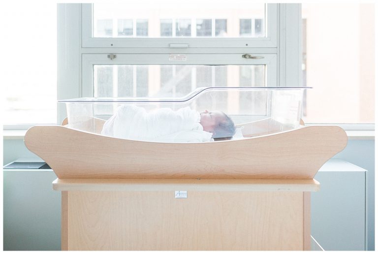
The last and final don’t on my list is geared mostly towards newborns or babies that are under a year old. The don’t here is don’t dress them in real outfits. What do I mean by a real outfit? Well, okay, you’re at Target and you’re in the baby section and there are literal outfits hanging on wee little hangers. So you’re looking at like a three month hanger. It’s a three month size outfit and it has a pair of pants. It has a onesie and then it has maybe a sweater on top of the onesie or a vest on top of the onesie. And on the hanger, it is so dang cute. And you know what? In real life, it is pretty cute too when you put a baby in like a real grown up outfit. But it does not photograph well. Oftentimes those outfits swallow up the baby andyou’re missing like half of their face because it’s buried in the sweater or it’s buried in the vest. And who does not want to see their little leg rolls? So when you are photographing a newborn baby or a baby under a year old, I love to keep things really simple. Simple white onesie, simple brown onesie, simple blue onesie, something very simple where I can see their arms, I can see their legs, I can see their whole big chubby face, and that is really what we are looking to photograph. If we put them in the outfit with the pants and the onesie and the jacket, it turns out then that we’re photographing more of the outfit and less of your baby. And I don’t want that for you.
So let’s do a quick recap there on all of the things we are not doing:
- We are not wearing matching outfits.
- We are not wearing graphic tees.
- We are not wearing neon colors.
- We are not showing up in things that make us feel insecure.
- And we are not dressing babies in real people clothes.
Okay, that wraps up my list of things that we are not doing. So now let’s get into the fun stuff.
Hey, pardon the interruption, but I wanted to take a quick pause to introduce you to one of my favorite brands and business besties, Polished Prints. If you’re anything like me, you’re a busy mama, and in the morning we are reaching for clothes that feel good, not just on our skin, but on our soul. Polished Prints is a feel-good apparel company made by a busy mom just like you for busy moms just like you. And yes, I have been talking about their mom crop for years and I swear by them. I’ve got one in just about every color and I find myself reaching for the mom crop again and again and again. I’ve even got my mom hooked on the mom crop. So whether you’re chasing toddlers or chasing dreams, Polished Prints has something that’ll make you smile every time you slip it on. You can shop all their goodies online at polishedprints.com. And when you do, use code KELSIBAILEY for a discount on your purchase. That’s K-E-L-S-I-B-A-I-L-E-Y for 10% off your purchase. And now back to the show.
Let’s talk about all of the things that we are going to do when we put together our session outfits. The first thing that we are going to do, mom, listen up. The first thing we are going to do when we start putting together our session outfits is to let mom pick first. Yep, mom, I want you to get first dibs. There’s a few reasons for this. The first and foremost being, you’re the one doing the coordinating and the planning of this session and ultimately, mom, these photos are for you. So I want you to get first dibs. I want you to find an outfit that you love and I want you to then coordinate the rest of the people in the photo around you. It’s gonna be way more fun that way anyway. When you are coordinating everyone else’s outfit around an outfit that you have chosen and that you already love, it’s gonna be way more fun than you putting together everyone else’s outfit and then realizing at the end, like, oh shoot, also I need to be dressed for these photos. So now what am I going to wear that’s gonna coordinate with everyone else? No, no, not this time. This time we’re putting mom first and I want you to pick out your outfit, something that you love and then coordinate everyone else around you. So that’s the first do.
The second do, and this one might sound kind of funny, but just hear me out, hold on until the end and you’ll see where I’m going with it. When you start to look for your session outfits, I want you to look around your house and see what kind of decor you have going on. Do you have a lot of neutral colors going on in your house? Do you have a very colorful decor style in your home? Why is this important? In the end, our ultimate goal here is for you to hang your beautiful images up on the walls of your home. If you are going out and you’re wearing outfits that may or may not clash with your decor, you might feel weird about that when you start to hang your photos on the wall. Now, I am just tossing that out there into the void. I live in a camp where everything goes together. I live real heavy, I lean real heavy into the mix and match kind of life. So I myself, I’m not terribly particular about things that do or don’t or may or may not match in my mind. Everything matches. So I wouldn’t be particularly picky about my family dressing in playfully colored clothes in my neutrally colored home. That wouldn’t bother me particularly. But if it is something that might bother you, then I encourage you to consider that when you start putting your outfits together. Just gonna toss that out there. Like I said, ultimately I just wanna make sure that when you hang your photos up, you absolutely love them. And I don’t want you thinking like, whoops, maybe we shouldn’t have done our photos in the fall season because now we have all these orange and yellow leaves in the background of every single image.And that looks a little bit out of place in our living room and I don’t really love that. So just something to consider when you start to put your outfits together. If you think you might be particular about how they fit into your home, I would kind of draw your session color palette from the colors that are already existing in your home.
Another do is the opposite of the don’t. Earlier we said don’t wear matching outfits. Instead, the do to that is we are doing coordinating colors. What does this mean? What does this look like? Let’s build out a little family.
Okay, let’s start with mom because that is the highest on our list of do’s. We’re going to start with mom. Let’s say that mom has decided to wear a mauve colored skirt. A mauve colored skirt, it’s chiffon and it’s pleated. It’s a midi skirt. And she is wearing her mauve pleated midi skirt with a fuzzy cream colored sweater. And that is what mom has chosen to wear.
So, when we start dressing the other members of our family, we are not putting them all in mauve and we are not putting them all in cream. That’s where the coordinating part comes in. Instead, we’re going to think what colors coordinate with the mauve color mom has selected. This is really easy to do in Google. You can literally just search “mauve color palette” and you’re going to get lots of different options and lots of different help to help you piece together colors that do and do not go with mauve.
In the mauve family, we’re thinking browns, tans, pinks, forest greens, those types of colors when we start to dress the rest of the people that are going to be in the photos with us.
Let’s say we are dressing our daughters next. So, mom’s in her mauve mini skirt, her cream sweater. We start to dress the daughters and I do not want the daughters to be in either the same color or the same style. By style, I mean mom is in a two-piece outfit. So, I don’t want both of our daughters to also be in two-piece outfits. So, I would opt to have one of the girls in a one-piece outfit, whether that’s a dress or a jumpsuit. I would put one of the girls in a one-piece outfit and then another girl, if there’s another girl to dress, I would put the other girl in a two-piece outfit, perhaps opposite of the colors of mom’s outfit.
So, maybe this looks like mom in her mauve mini skirt, her cream sweater. This looks like another daughter in maybe a pale ballerina pink dress. Maybe it looks like a pale ballerina pink jumpsuit. And then another daughter, if we’re dressing a third girl for these photos, I would put her then in a darker colored top with a lighter color bottom so that they’re all complimentary. They’re not all in exactly the same style or the same colors.
Then we will move on to the boys and we’re going to do the same thing for the boys that we’re outfitting. We do not, under any circumstance, want dad to also be in a cream sweater. If mom is in a cream sweater, chances are high that mom and dad are going to be posed closely together when we’re doing these photos, whether we’re doing them in a family session or a newborn session.
So, if mom’s wearing cream, I want dad to not be wearing cream, but again, to be wearing something in our color palette. Maybe he’s wearing a tan cashmere sweater. Maybe he’s wearing a tan flannel plaid button-up with a corduroy jacket on top and some jeans. Maybe he’s wearing some khaki-colored corduroys and a forest green button-up with a, I don’t know, tan cashmere sweater on top. Whatever that looks like, it needs to be, again, kind of the color opposite of mom. So, if mom’s in her cream sweater, I would want dad to be not in a cream sweater, okay? Same with the boys and then the same style rule applies, which I know is trickier for boys, but I would want them to be kind of opposite as well.
If dad is wearing a darker colored top on his top half, then I would maybe want the son to be in a lighter color on his top half. Just, again, for the sake of being not matchy-matchy and more coordinated.
And another thing that I want you to keep in mind here when we start to talk about colors is that they don’t all have to be solid either. I’m going to go out on a limb and I’m going to say what I say and I’m going to stand by what I say. And I think when it comes to colors, quote-unquote, more is more. What do I mean by more is more? I think you can mix and match different patterns. Plaids, florals, stripes.This can help kind of break up some of that blocky color and weave colors in and out. So I think more is more. You can mix and match different patterns. And I think in a color palette sense, this is a really beautiful way to pull. outfits together.
I have one final note to make with regards to coordinating colors and color palettes in general. And it is actually an answer to a question that I am asked pretty frequently by both other photographers and my clients. And they ask, how do you get your images so bright and airy? And I love this question because I spent many, many years studying the light and perfecting my editing style so that I could deliver the bright and airy images that I loved long before I was even a photographer. So I love this question. But the answer is that it takes two to tango.
Okay, it takes two to tango, which means I can shoot in bright and airy light all day long. And I can apply my bright and airy edit to your images all day long. But if you are not there tangoing with me, then your images may not be as bright and airy as you thought. And I mean this to say, if you are indeed in the market for the bright and airy images that have kind of become a signature of my business, if that is the vibe that you’re going for, I suggest and encourage you to lean into lighter, more neutral coordinating colors.
Again, this does not mean everyone is showing up wearing white. It does not mean everyone is showing up in matching white cream tan outfits. What that means is that I would encourage you to lean into a lighter, more neutral color palette. Think your creams, your camel browns, your light tans, your sage greens, your ballerina pinks, any of those colors, lavender even, are very beautiful and they reflect the light. So your images are going to be much lighter, much brighter if those are the colors that you are in.
That doesn’t make those colors right or wrong. I’m not saying that you cannot opt for a darker color palette, say a charcoal gray, navy, blue, and a dark brown. That can also be a coordinating color palette. It just isn’t going to yield images that are as bright and airy as what you see me posting online. So that is my last note there.
I have had clients from time to time who have opted to wear a darker color palette and then been like, why don’t these feel as bright and airy as I thought? I thought a lot of your images were more of that bright and airy feel. And so I do want to toss that in as a note. If it’s important to you to really bring that bright and airy vibe to life, it takes two to tango. It requires the light and the editing on my part and the lighter neutral color palette on your part.
Now, please do not be shy. I was having conversations just this week with clients of mine. They’re sending me images of the outfits as they’re selecting them. And they had everything all nailed down and ready to go. And then mom found a really beautiful brown dress for their youngest daughter. The problem was that dad’s pants were also the same color brown as the daughter’s dress that mom wanted her to wear. So we simply tossed out dad’s dark brown pants and he opted for a lighter color pant so that their youngest daughter could wear the brown dress that they found at the last minute and that they loved.
So do not be shy to lay things out on the floor and pull things out and put other things in and send those images my way. I love talking about this stuff with you guys. And it’s not a burden. So don’t for one second start laying things out and taking photos and then get shy about sending like, I don’t want to bother her. Gosh, I don’t want to send one more email to her. No, please do. Please do. I love talking about this stuff with you. And I, through the photographer lens that I’m looking at everything through, I can help you decide what fits and what doesn’t.
So that is a really long do for the next do on our list, which was do coordinate your colors and your styles. So far we have given mom first dibs on selecting her outfit. And we have talked about how to coordinate our colors together to make them feel less matchy matchy, more coordinated, both in color and in style.
And the next, actually the second to last thing on our list of dues is texture. I love texture and I cannot wait to talk about it. Texture, I think, is the key to making your photos jump to the next level. They are really going to elevate the look and the feel of your photos.
By texture, I’m talking about the material with which your clothes are made. Think leather, tulle, lace, satin, corduroy, chunky sweaters, cashmere sweaters. All of those are different textures. And youcan mix and match these textures as much or as often as you like. That’s the best part about texture. You can wear mom’s pleated miniskirt. Those pleats, they’re a texture. The sweater that we talked about where he talked about being like a fuzzy cream sweater, that’s a texture. I would love for everyone in the photo, mom, dad, kiddos, babies, I would love for everyone to have a different texture going on in their outfit. This is really going to bring your session wardrobe to the next level. I think it’s really going to be the key difference between great photos and amazing photos is going to be the amount of texture that you can draw into your images. It’s king. Texture is king. And like I said, it is kind of fun once you start to mix and match and kind of play with the texture a little bit. It’s a little bit of a challenge, but in a fun way to make sure that everyone has a different sort of texture going on.
Over the weekend, I had a family and they come outfitted perfectly every single year and this year was no exception. And I’m going to walk you through their outfit to show you how all of the different textures were important. Mom was in a silk mini skirt and then she was in a sweater. The oldest daughter was in a very furry texture style sweater and then she was wearing a mini skirt that had a floral embroidery print on the front. The youngest daughter had a leather skort on. So the skort, when you start to think about it, is another layer of texture, right? The skirts and then the flap that came over the front was another layer. It was perfect. And then her little sweater had ruffles around the collar and it had ruffles around the sleeves. Ruffles are another great way to incorporate texture. And dad was in corduroy pants and a sweater. So it doesn’t have to be hard. It doesn’t have to be complicated. But when you think about all the different textures that they had brought into that family of four, they had the silk, they had the embroidery, they had the furry sweater, they had the ruffles, and they had the leather. All of that together added so much yumminess to their photos. It was perfect. And I know that you can do that too.
Now that we’ve talked about it, I know that you’re going to take all of these do’s and you’re going to show up looking and feeling like the absolute best versions of yourself at your session. I can hardly wait.
As a quick recap so far, our do’s:
- Mom’s going first, getting first dibs.
- We are coordinating our colors. We’re not matching them.
- We are also mixing and matching prints and styles.
- We are absolutely adding texture to everyone’s outfit.
- And now finally, the last little thing on my list of do’s is do pay attention to shoes.
Okay. I know that one’s not super fun and that’s kind of why I left it right there at the end. But do think about shoes, especially for your kiddos. I know my kids in particular fly through shoes. We are at ages, they are 10, 8, and 5, and we are flying through shoes like nobody’s business. Shoes are not top of mind for me on a day-to-day basis. So I’d be willing to bet they might not be top of mind for you either. But when we’re talking about getting dressed for our photos, I do suggest making sure that your shoes are on point. When my kids go to school, all three of them are wearing tennis shoes. I don’t know that I want tennis shoes in my family photos. Maybe you do not mind tennis shoes in family photos and that’s awesome. Remember earlier when I said that I didn’t care whether my family’s session wardrobe mixed or matched with the interior colors of my home? I don’t care so much about that. Maybe you care more about that and less about your kids wearing tennis shoes in the photos. I’m just throwing it out there as something to think about because, of course, we’re dressing from head to toe and then sometimes we can like, oh shoot, we also need to be wearing shoes. And my kids are wearing primarily tennis shoes and then you show up wearing the tennis shoes and then you’re going to fall into that don’t, which is don’t come feeling insecure about anything. So that is my last and final do on this list is yes, do please consider shoes, particularly when it comes to your kids.
If nothing else, if you’ve got, oh goodness, I’m sorry, my dog is sitting right back here. He was napping very soundly and now he woke up and just shook his fur all over. So sorry if you heard him in the background. But back to shoes, if nothing else, just grab something cheap on Amazon, some little ballet flats, some little Mary Janes, some little loafers for your boys. And I think you’ll be much happier in the end if you do that than if they are showing up wearing their school tennis shoes for their photos.
And last but not least, we have finally arrived to those extra cherries on top. These are all just as they are. They are cherrieson top. They are bonuses. They are extras. They are wants, not needs when it comes to picking your session outfits. So if you are in the midst of doing all of your planning and you’re feeling like doing something just a little bit extra or you want to cross all of your T’s and dot all of your I’s, then these cherries on top could be for you. But if not, that’s also okay. The outfits that you have selected are amazing. You’re amazing. You’re going to look amazing. And I cannot wait to see you.
But again, if you’re feeling a little extra, here are a few extra things that you can consider or think about or add to your session outfits:
- Accessories: Your belts, your headbands, your headscarves, your jewelry. All of those things can add extra color, style, texture. They also can kind of skew the vibe of your outfits one way or the other. For example, if you’ve got your outfit on and you’re heading out the door and at the last minute you put on your pearl necklace and your pearl earrings, that’s going to make your photos have a bit more of an upscale, formal, fancy vibe. Do you see what I’m saying? And all you did was add your real pearl jewelry. It’s just something to consider if you want your photos to be skewed one way or another. All of those accessories are a really great place to plug and play and see what vibe feels good.
- Removable Items: Things that are layers that can be removed during the session to give you two different vibes or two different looks, if you will. I’m thinking things like if dad shows up and he’s in a sport coat and halfway through the session, we just ditch the sport coat. And then instead, he’s just wearing his button-up or his sweater or whatever he was wearing under his sport coat. That way dad can have two different looks, two different feels in the images. The same can be said for anyone who’s wearing like a big chunky cardigan or maybe the scarf that you brought or any of those things that can be removed during the session. I’m happy to do that if you want. It’s just, like I said, an additional extra option where you can have a couple of different looks, a couple of different vibes for your session without having to change outfits entirely. Just removable items of clothing can be a really fun way to do that.
- Makeup: Ladies, I am talking here to you specifically, and I’m talking about makeup. On a good day, on a good day, I am lucky to get out of the house with my moisturizer and mascara on, okay? That is like a really, like I said, a really good day for me. But on a day of a photo session, I would opt for more makeup than that. I would be doing all of it, the foundation, the eyes, the mascara, the blush, and I would even be so bold as to put a red lip on myself. I’m not saying you have to do all of those things. I am just saying it’s a really great opportunity to kind of up-level your makeup game just a little bit, and your kids will probably be looking at you like mine would, like, whoa, mama, like that, we don’t even hardly recognize you. I promise you are recognizable, okay? And you will probably be even happier with your photos if you make a couple bold makeup choices, only because it will photograph better. I don’t really have a better explanation for that, and I don’t want that to sound like you will not be beautiful if you don’t show up with a face full of makeup, but it’s not going to photograph as bold or as clownish as you think it might. So if it is something that you want to play with and experiment with, I encourage you to do so. I would, like I said, do it myself, go a little heavier on my makeup on a session day, just for that extra bedazzlement as far as the photos go. I will also put a little bit on my girls as well. We’re pretty conservative about that. Obviously, here I am just like the moisturizer, mascara gal on a normal day. So even my girls, though, who are 10 and 8, I might invite them to add a little mascara if they want or a little lip gloss, just like I said, as a little extra bonus. It might just brighten their eyes up a little bit or make their smile just a little bit brighter.
Woo! I don’t know about you, but I thought that was a lot of fun. This has been something that I have struggled with in my business since it started. I’ve really struggled to help clients really dial in and find outfits that make them look and feel like the best version of themselves. So I’m thrilled that I could slip this all into a podcast episode that you can digest way easier than like a 25-page PDF style guide. So I hope that you are listening to this while you’re doing dishes or the laundry or driving your kids to and from their activities. I am just glad that I could spell it all out here for you because I, at the end of the day, like I said, just want you to show up at your session looking and feeling like the best version of yourself. And so if this list of do’s, don’ts, and little cherries on top was helpful, then I have done my job.
We are just going to recap quickly one more time. And I amalso going to remind you here that episode number two, Are You Making These Three Wardrobe Mistakes?, is ready and waiting for you. It is just to help you avoid three Wardrobe Mistakes. you avoid three of the most common mistakes that I see people making when they outfit themselves for their sessions. So go back, give that one a quick listen after this one.
But quick recap, what are we not doing when we are picking our session outfits? We are not:
- Wearing matching outfits.
- Wearing graphic tees.
- Wearing neon colors.
- Wearing anything that makes us feel insecure.
- Putting babies in real clothes.
The things that we are doing, the things in our do column:
- We are letting mom get first dibs and she is picking her outfit first.
- We are considering our interior design as part of our wardrobe choice. I just want to make sure that once you are hanging your photos up on the wall, that you feel good about how they vibe with the rest of the decor that’s in your home.
- We are color coordinating our outfits. We are not matching them.
- We are adding texture and a lot of it.
- We are also not forgetting about our shoes.
As far as our cherries on top, we are talking about accessories that can elevate or sway our outfits in one direction or the other. We’re talking about removable wardrobe items that we can just toss off and on real quick for a different look or a different vibe. And we are talking about bold makeup choices.
Okay, lovelies, that’s a wrap on our chat for today. Thank you for allowing me to zip into your earbuds. I know your time is valuable and I’m so grateful that you chose to spend some of it chatting with me. I hope you’re walking away with a smile and maybe a bit of inspiration too.
To revisit today’s discussion, you can head to kelsibailey.com slash podcast for show notes and discount codes from today’s sponsors. If you’ve enjoyed our conversation, I would be honored if you leave a review, subscribe to the show or share this episode with a friend. Now go give those you love an extra snuggle. May your coffee cup be bottomless and I’ll meet you right back here in the next episode of the Kelsi Bailey Photography Podcast.