
path to preset perfection bootcamp | day 2
COLOR
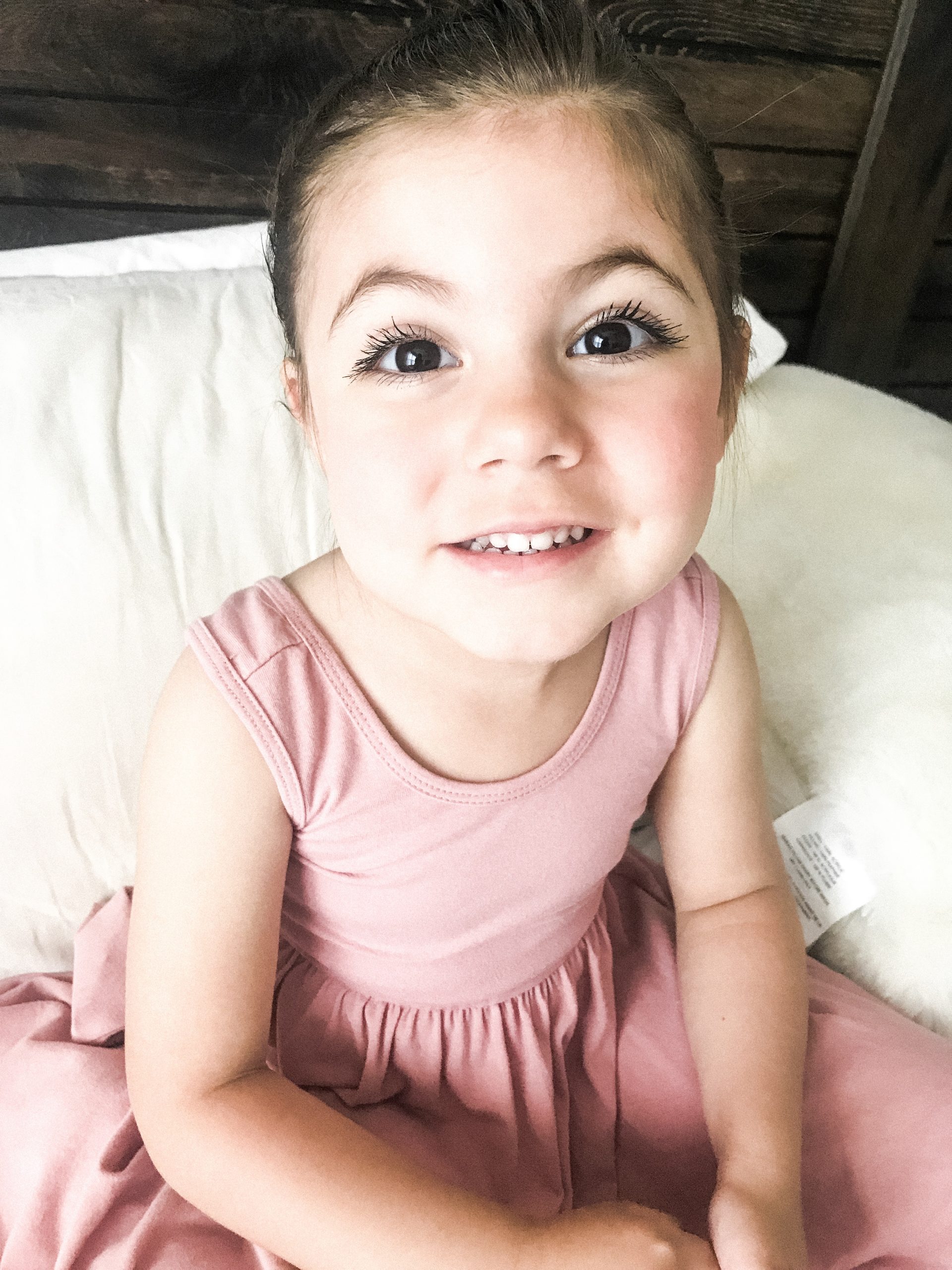
next to the ‘light’ icon in your editing panel, you’ll see an edit called ‘color.’ there are two major edits to talk about with regard to the color in your photos. the first is temperature. temperature refers to how warm or cool your photos are. this is largely a personal preference so there is no right or wrong edit. simply speaking, photos that are more yellow or orange in color are referred to as warm images and images with blue and purple tones are referred to as cool. a good rule of thumb is to find something white in your photos (eyes, clothes, clouds) and from there, determine how true the white feels to your eye. does the white appear more blue to your eye? if it does, then you need to warm up the temperature of your photo (move the temperature slider to the right). if the whites appear yellow, then you can cool down your image by moving your temperature slider to the left.
the other important edit to consider when evaluating the color of your photo is the tint. tint refers to the green and pink qualities of a photo. i much prefer a pink tint to a green one (i love sweet, rosy cheeks!) so you’ll notice that i bumped my tint a smidge in each of my presets. however, if you apply a kelsi bailey preset and find that the photo still feels green to you, bump the tint slider to the right to add a little more pink. if the pink is too much, simply move the slider to the left to remove some of the pink tint.
you did it! that’s a wrap on day 2! if your mental muscles are feeling a little sore from your workout yesterday and today, take the rest of the day off and take a breather…but don’t get too comfy because tomorrow we’re going to dive right into the ultimate batch edit game changer! I’ll see you then!